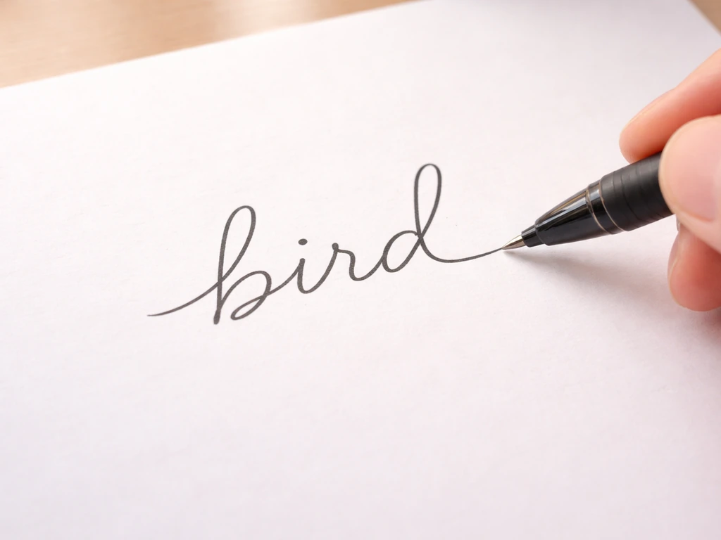
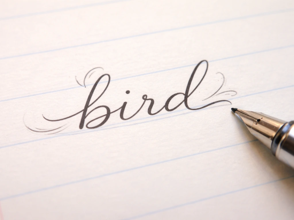
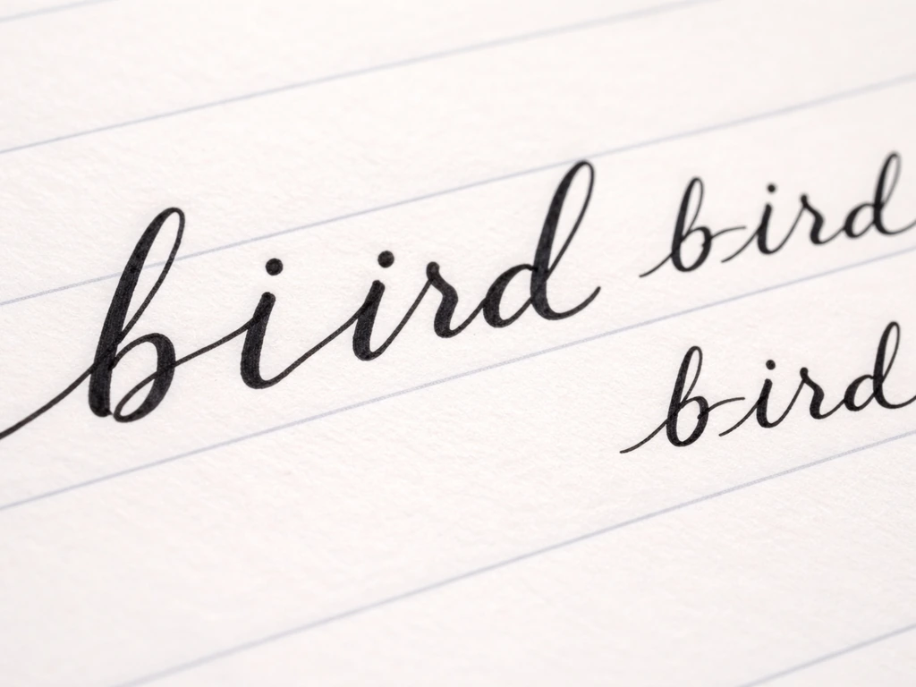
To write 'bird' in cursive, you connect four lowercase letters in one smooth stroke: a looped b that exits upward, a dotted i that flows right, a rounded r that curves back up, and a d with a tall loop that finishes with an exit stroke. The whole word should sit on a single baseline, lean slightly to the right (around 5 to 15 degrees), and feel like one continuous motion once you have the joins down.
How to Write Bird in Cursive: Letter by Letter Guide

James Ridgley
7 May 2026
If you've been searching because you want to write a bird species name in cursive, the same letter-by-letter logic applies. Once you can write the word bird, you can also write a bird you can write on for a specific species or message. Any name starting with a b, including words like 'bluebird' or 'bunting', uses the same b formation and joins covered here.
What 'bird in cursive' usually means (and one small distinction)
Most people searching for 'bird in cursive' want to write the common English word, not the name of a specific species. That said, if you're writing something like 'Mockingbird' in a journal, a field guide annotation, or even a pet name card, the process is exactly the same: you're just applying cursive letterforms to a longer string. The fundamentals of cursive b, i, r, and d show up constantly in bird-related vocabulary, whether you're writing 'bird', 'ibis', 'robin', or 'finch'. So once you nail the word 'bird', you're already partway to writing dozens of bird names in cursive.
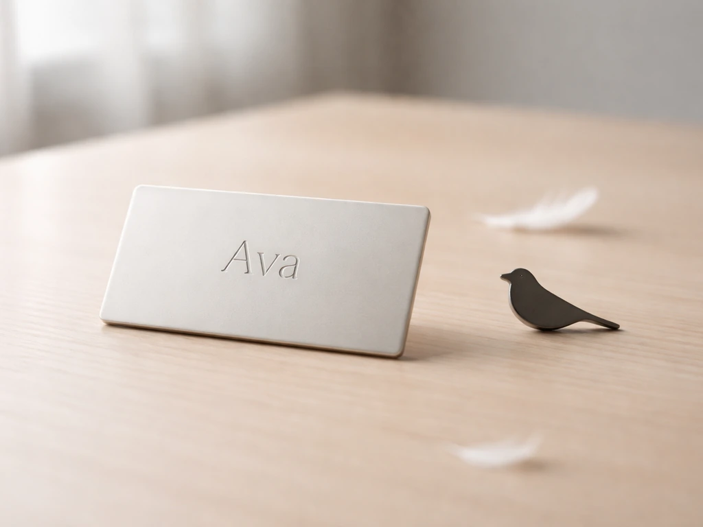
There's also a secondary interpretation worth flagging: sometimes people aren't looking for handwriting help at all, but for a stylized font or a decorative rendering of the word. If that's you, a quick search for 'bird cursive font' or 'bird calligraphy' will get you there faster. This article focuses on actually writing it by hand, letter by letter. In Ava’s case, the name often gets asked about as a bird name or bird meaning, so the usual guess is tied to how people interpret its origin.
The shape of each letter in 'bird'
Cursive is essentially a system of entry strokes, body shapes, and exit strokes. Every letter has all three, and the exit stroke of one letter becomes the entry stroke of the next. Here's how each letter in 'bird' works in standard modern cursive (which most English-speaking countries teach today).
Lowercase cursive b
Start at the baseline, swing up to the ascender line (the top zone, roughly twice the height of your lowercase letters), then loop back down and around to form a rounded bump on the right side. The exit stroke curves up and to the right, sitting just above the baseline, ready to connect into the next letter. The loop at the top of the b is what separates it from a print b. If your loop is too small or collapses, the letter starts to look like an l. Keep the top loop open and oval-shaped.
Lowercase cursive i
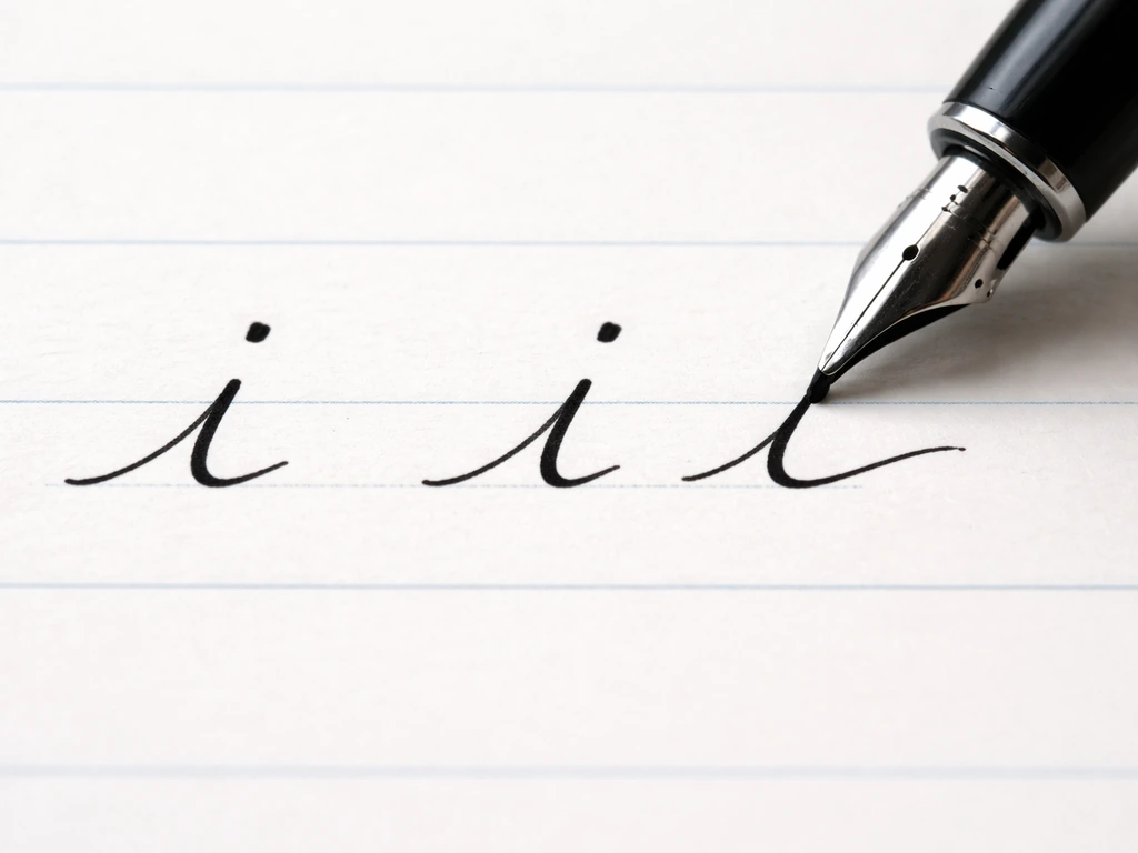
This is the simplest letter in the word. Come up from the baseline in a gentle undercurve, tap the top of the x-height zone (the middle zone where most lowercase letters live), then curve back down and exit along the baseline to the right. After you've written the full word, go back and blank" rel="noopener noreferrer">add the dot just above the body of the i. Dotting as you go can disrupt your flow when you're still learning the joins. For a similar approach to keep the stroke sequence smooth, dot the i's after completing the last letter when a word has multiple i's, rather than interrupting mid-flow blank" rel="noopener noreferrer">Dotting as you go can disrupt your flow when you're still learning the joins..
Lowercase cursive r
The cursive r trips a lot of people up because it looks very different from its print version. In most modern cursive styles, the r is an undercurve up to the midline, a small shoulder that bumps right without going all the way down, and then a second shoulder that does the same. Think of it as two small bumps sitting on top of a baseline entry, both staying within the x-height zone. The exit stroke curves down and to the right along the baseline. It doesn't loop or rise the way b or d does.
Lowercase cursive d
The d is essentially a cursive a with a tall ascender loop added. Start with an undercurve up to the midline, form an oval (going counterclockwise, left and around), then instead of exiting at the bottom like an a, continue upward all the way to the ascender line, loop over, and come back down to the baseline. Exit to the right. Some handwriting programs describe the join into d as a 'touch join,' meaning the exit stroke from the previous letter barely grazes the entry of the d rather than making a dramatic arc.
How to connect b, i, r, and d smoothly
The joins are where cursive either clicks or falls apart. Here's how each transition works in 'bird':
- b to i: The exit stroke of the b curves up gently from the baseline. You flow directly into the undercurve that starts the i. There's no lift. The connection stays low, near the baseline.
- i to r: After the i body, your exit stroke sweeps right and slightly upward. The r picks up from that same height with its first undercurve. This join feels very natural because both letters live in the same x-height zone with no tall loops to navigate.
- r to d: This is the trickiest join in the word. The r exits along the baseline, and you need to flow into the oval of the d without making an awkward gap or a bulging curve. Think of the exit from r as a gentle lead-in that starts the counterclockwise oval of the d. Some instructors call this a diagonal join because you're angling slightly upward to begin the oval. Keep the transition tight and don't over-swing your approach stroke.
The whole word should feel like one continuous pen movement with one lift only: when you add the dot above the i after finishing the d. If you're lifting your pen between every letter, you're writing connected print, not true cursive.
Practice drills: from single letters to the full word
Don't jump straight to writing 'bird' from scratch. Muscle memory builds in layers. A focused 10 to 12 minute drill session is enough to make real progress. Here's the progression:
- Write each letter five times in isolation. Do b, i, r, d separately, slowly. Pay attention to entry and exit strokes specifically, not just the body of the letter.
- Write two-letter pairs: 'bi' five times, then 'ir' five times, then 'rd' five times. Each pair should be one unbroken stroke.
- Write the full word 'bird' five times slowly, focusing on keeping all joins connected and the slant consistent.
- Write 'bird' five more times at a slightly faster pace. Don't rush, just relax your grip and let the strokes flow.
- Write a short phrase: 'a bird', 'the bird', or 'small bird'. Adding real context helps your brain wire in the motor pattern as a real word rather than just a practice shape.
- Go back and self-evaluate: are the slants matching? Is the i dotted? Are the loops (b and d) the same size and shape?
For the best results, use lined paper with a visible baseline and a midline (the kind used in elementary handwriting workbooks). The zones matter: b and d ascenders should reach the top line, i and r bodies should stay within the x-height, and none of the letters in 'bird' have descenders, so you won't need to worry about the bottom zone for this word.
Fixing the most common mistakes
Here are the problems that come up most often when learning to write 'bird' in cursive, and how to correct them quickly:
| Problem | What it looks like | Fix |
|---|---|---|
| Inconsistent slant | Some letters lean right, others stand straight or lean left | Pick one slant angle (5 to 15 degrees right is standard) and commit to it. Draw a light diagonal guideline across your paper and match every letter to it. |
| Collapsed b or d loop | The tall loop flattens into a bump or disappears entirely | Slow down and exaggerate the upward swing before looping. The ascender should reach roughly twice the x-height. |
| Awkward r to d join | There's a gap, a bump, or the d oval looks squashed on entry | Practice the 'rd' pair in isolation. Focus on how the r exit stroke angle feeds directly into the d oval without extra curves. |
| Overcrowded spacing | Letters mash together so the word is hard to read | Give each letter its own space within the word. A light gap (sometimes called a hairline gap) between letter bodies is fine as long as the exit and entry strokes connect. |
| Missing or misplaced i dot | The dot lands on the wrong letter or gets skipped | Always dot the i as a second step after finishing the whole word. Never dot mid-word; it breaks your rhythm. |
| Shaky or uneven baseline | The word drifts up or dips down across the page | Use lined paper. If you're on blank paper, lightly rule a baseline in pencil and erase it later. |
Legibility is the real goal, not perfection. If someone can read 'bird' at a glance, your cursive is working. Inconsistent slant is the single most damaging factor for overall readability, so if you only fix one thing, fix that.
Cursive style variations: which one should you use?
Not all cursive looks the same, and if you've seen different versions of letters online and gotten confused, that's why. The two most common styles taught in North American schools are Zaner-Bloser and D'Nealian, and they handle joins slightly differently.
| Style | Key feature | How it affects 'bird' | Best for |
|---|---|---|---|
| Zaner-Bloser | Rounder, more upright letterforms with distinct entry and exit hooks | The b and d loops are more oval and open; joins are explicit and easy to see | Beginners who want clarity and structure |
| D'Nealian | All lowercase letters start with an entry stroke from the baseline; slightly slanted by default | Entry strokes are built into every letter, making transitions feel more automatic; the word flows with less deliberate effort | Learners transitioning from D'Nealian print, which already uses tails |
| Spencerian / Copperplate | Thin upstrokes, thick downstrokes, very oval letterforms, elegant pressure variation | The word 'bird' becomes quite stylized; the r in particular looks decorative rather than practical | Calligraphy enthusiasts or decorative lettering projects |
| Modern casual cursive | Personal, slightly inconsistent style that mixes print and cursive elements | Joins may be partial; some writers connect only some letters in the word | Everyday fast writing once the basics are solid |
If you're learning cursive for general use, start with Zaner-Bloser or D'Nealian depending on what your school or workbook uses. Both will produce a clean, readable 'bird'. If you're writing a decorative bird name (for a pet tag, a greeting card, or something similar), look at Spencerian-style tutorials for a more elegant result. The letter-by-letter logic is the same in all styles; only the weight, angle, and loop proportions change.
Making it look like real handwriting (not robot practice)
There's a point in learning cursive where your writing looks technically correct but stiff, like you're copying letters rather than writing naturally. Here's how to get past that:
- Relax your grip. You don't need to press hard. Light, consistent pressure lets you move faster and produces smoother curves. Pressing harder will not improve loops; it usually makes them worse.
- Speed up gradually. Slow practice builds accuracy, but natural handwriting requires some momentum. Once you can write 'bird' correctly ten times in a row slowly, try writing it at a conversational pace. Speed often actually smooths out awkward joins because you're not overthinking each stroke.
- Keep your baseline stable. Your wrist and hand position affect baseline drift more than anything else. Rest your hand on the paper and move from the wrist, not the fingers, for longer words.
- Use consistent letter sizing. The b and d loops should be the same height. The i and r bodies should be the same height. If one letter is noticeably bigger or smaller than the others, the word looks uneven even if every individual letter is technically correct.
- Write whole words, not just letters. Muscle memory for joins builds when you practice them in the context of real words. Writing 'bird' 20 times will do more for your cursive than writing b, i, r, and d separately 20 times each.
One habit that helps enormously: after every practice session, write the word once without thinking about it. Just write it naturally. Then look at it. That version, however imperfect, shows you what your default cursive actually looks like, which is far more useful feedback than a row of careful practice letters.
If you're interested in other bird-related spelling and writing questions, the same attention to letter formation applies whether you're writing the name of an aviary or working through species names from other languages. If you mean the phrase “bird” in an Egyptian context, look up how to type “bird” from Egypt for the right keyboard setup and spelling. The word 'bird' is a useful anchor because its four letters cover a wide range of the most common cursive joins, making it one of the better short practice words for building connected handwriting skills overall. When you spell the word vulture, the same connected cursive idea applies to keep the letters flowing smoothly.
FAQ
Should I write the dot on the i before I continue into the r, and do I need to lift my pen?
If you dot the i immediately after finishing the i body, do not lift the pen to dot it. Instead, pause for a moment at the top, touch down to add the dot, then continue to the r exit. This keeps the word in true cursive, with one continuous flow, and avoids awkward spacing before the r.
What spacing or height checks should I do so the word bird looks even and readable?
It is normal if the b, i, r, and d do not look exactly identical in size at first, but the overall baseline alignment matters. Aim for each letter body to rest on the baseline and keep the ascender parts (b loop top and d tall loop) reaching the same top line height, so the word reads as one unit instead of stacked letters.
My b loop collapses and looks like an l. How can I fix that quickly?
If your b top loop turns into an l, make the loop oval and keep it open, then exit with a gentle up-and-right stroke. A common fix is to practice just the b loop on lined paper, focusing on the top loop shape and the direction you leave it, before you reconnect to i.
What is the fastest way to improve legibility if my joins look okay but the handwriting is hard to read?
For consistent readability, use a steady slant and avoid changing slant mid-word. A quick test is to write bird three times in a row and compare whether the i dot and the exits of b and d tilt the same way. If the word “leans” differently each time, your joins will also look inconsistent.
I learned cursive in a different school style. How do I adapt the bird letter joins to my own style?
If you are writing with a slightly different cursive style than your workbook, the safest approach is to match zones and exits rather than copying every curve. Keep b and d ascenders to the same top zone, keep i and r within the x-height zone, and use a touch join from the previous letter into d so the connection feels natural even if the exact curve differs.
Can I add flourishes to make bird look nicer, or will that ruin correct cursive learning?
Yes, but it changes what looks “right.” In cursive writing, you normally write connected forms first, then apply weight, flourish, or extra decorative swashes afterward. If you add heavy flourishes while learning, it often hides whether your loops and joins are correct, so keep early practice plain and only decorate after the base form looks consistent.
How do I know if I’m truly writing it as connected cursive rather than connected print?
Avoid adding a separate stroke before each letter. In practice, write bird without lifting the pen between b, i, r, and d, then add the i dot after completing the rest of the connected word. If you see gaps between letters or re-start strokes, it usually means you are lifting or re-initiating instead of continuing the exit into the next entry.
My bird looks technically correct but stiff. How can I make it flow more naturally?
If it starts looking stiff, do a short “natural pass” after drills, and stop copying after that. The goal is to let your hand find its default rhythm. Another helpful cue is to slow down only at the most complex transitions (b to i, r to d), while keeping the other connections smoother and faster.
Next Article
Does Ava Mean Bird? Meaning, Origins, and How to Verify
Find out if Ava means bird, including origins, language differences, and steps to verify the exact bird species or nickn